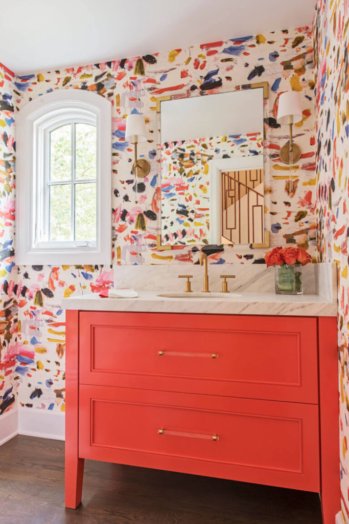
The year of 2023 should be declared as the year of color! The biggest design trend of the year is COLOR!
We all spent the last two years primary in our homes and that time taught us all one thing…many of us either neglect our homes OR our homes lack personality.
It is no wonder that homeowners are embracing color!
Every year paint manufacturers select a color of the year, and they usually provide a coordinating color palette.
Let’s talk about Sherwin William’s and Benjamin Moore’s 2023 colors of the year and you can incorporate these colors in your home.
First things first, why does the color of the year matter?
Paint companies select a color of the year based on previous trends and projections for upcoming trends.
These color selections show us where the industry thinks design is going. By no means are these colors that you MUST use on your next project.
As an interior designer every year there are colors that I love and colors that I would never use on a project!
Consider these colors as a source of inspiration.
Let’s get to it.
Sherwin William’s
Sherwin William’s has been the leading paint manufacturer in the country for years now. SW offers great color selections, reasonable pricing, and color match capability.
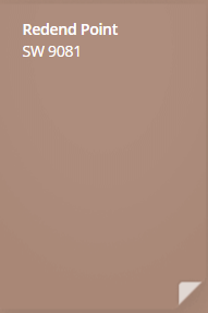
Sherwin William’s selected Redend Point as the color of the year. SW describes Redend Point as a “warm, intriguing and soulful neutral that inspires us to create deeper connections with the world.”
This color is reminiscent of clay and the desert. Redend Point is a warm blush earthy color with gray undertones.
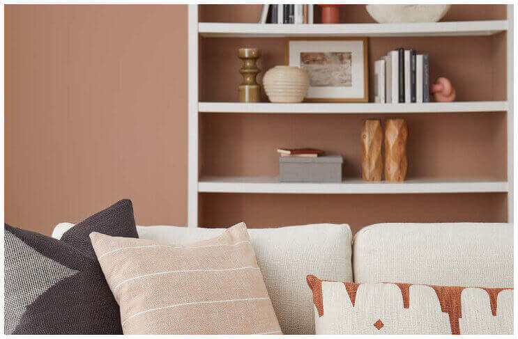
Redend Point is a beautiful neutral with tons of personality.
This color is versatile and can be combined with any color or texture and feels calm, it evokes warmth in a space. This color can be used on entire room, accent wall, cabinetry, or other furniture.
I don’t think is a color I would be using in my own home (I am a dark and moody kinda girl) but this color is gorgeous.
The best part?
Sherwin Williams created a color palette designed to coordinate with this color.
The color palette includes:
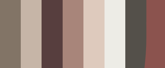
Colors listed below from left to right
Sherwin William’s hit the mark with this palette! These colors are a perfect complement to the Redend Point and offer something for everyone.
Benjamin Moore
Benjamin Moore is another major paint brand and another company that is all about the color comeback.
Benjamin Moore’s color of the year is Raspberry Blush.
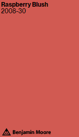
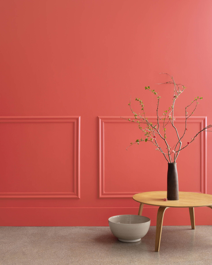
The name describes this color to a “T”, Raspberry Blush is a bright pinky coral color. This color is vibrant, bold, and will truly make a statement.
Raspberry Blush is fun, unexpected, and feels happy.
Can a color feel happy? You’re damn right it can.
This color will brighten up a room and would be fun in a powder room or girl’s bedroom. This color would be stunning on a piece of furniture.
Would I use this color in my home?
My initial reaction to this color was that it was too bright, bold, and that it felt red to me.
The more I have studied this color the more I have grown to adore it. I think it would make a beautiful dresser or accent chair.
I still do not think I am convinced of using it as a wall color but hey… anything is possible.
Let’s talk about Benjamin Moore’s color palette.
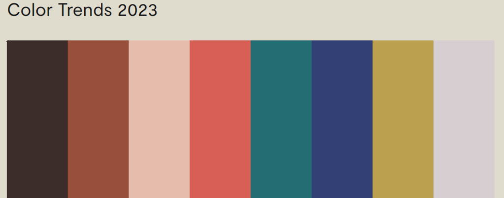
Colors include:
My thoughts?
I don’t understand this color palette.
If the goal was to select seven random colors from the wheel, then this is perfect!
The idea is to give people complimentary colors that can be used in tandem with Raspberry Blush and these colors are not it. I don’t think these colors would work well together because they would all be competing for center stage.
Overall, it is always exciting to see what the paint companies forecast for the new year. Just like Chip, your local meteorologist – paint companies can be wrong too.
While I do enjoy the influx of color, I cannot say I will be running out and painting my walls any of these colors.
Well, I take that back- I do LOVE Urbane Bronze by Sherwin William’s and would paint my walls in a second! Talk about sexy!
What are your thoughts?
Would you dare to take on any of these colors?
